Data visualization is a powerful tool local leaders can leverage to communicate insights with both internal and external audiences. Ranging from data on internal operations to metrics tracking the outcomes of policy implementation, local leaders have access to a host of disparate data points. Visualizing this information can unlock its potential in helping municipalities identify trends, highlight critical insights and identify areas for continued improvement. Moving beyond information sharing to robust storytelling provides local leaders with the opportunity to actively communicate insights through data visualization to promote innovative policymaking.
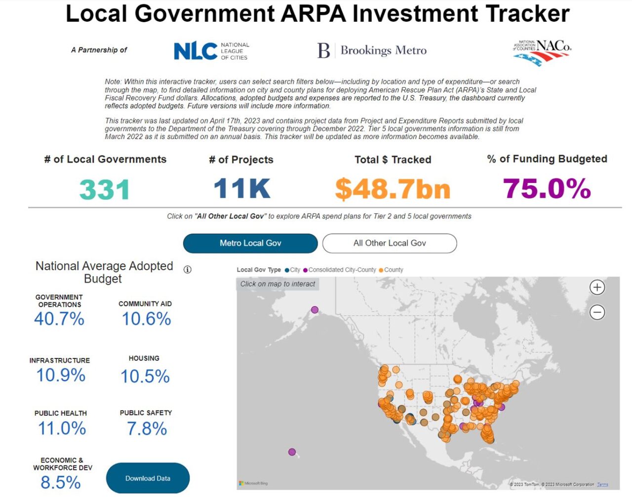
During the COVID-19 pandemic, many municipalities ventured into the data visualization space by launching public health dashboards to track case numbers and community spread. Other communities began to stand up dashboards tracking how they were spending American Rescue Plan Act (ARPA) funds to promote transparency and solicit public feedback (e.g., Akron, OH, and Minneapolis, MN). Other municipalities leverage data visualization in a range of policy areas, including transportation planning with Vision Zero initiatives (e.g., Cincinnati, OH), digital equity mapping to identify underserved areas (e.g., South Bend, IN), neighborhood prosperity dashboards (e.g., Austin, TX) or tree canopy coverage to promote environmental sustainability (e.g., Baltimore, MD).
Policy Recommendations
Regardless of whether your community is well-versed in producing data visualizations or whether you are interested in getting started, you should start by asking several key questions.
- Why?
One of the critical elements of storytelling is the active communication of valuable insights. This communication will build trust and transparency with residents and generate collective action toward a common vision. Getting clear on the key insight or storyline you want to communicate will help frame and inform how the visualization is developed. For example, with pedestrian safety (Vision Zero) mapping, if the goal is to evaluate the effectiveness of newly installed bike lanes, merely mapping out car crashes would only tell part of the story. A more effective data visualization connected to this why would include both car and pedestrian crashes overlaid with bike lane infrastructure to determine whether crashes are less frequent or severe in certain neighborhoods when compared with others. This storyline could then catalyze collective action to build more bike lanes and/or generate buy-in to slow down car traffic.
- Who?
Equity should play a central role in the development of data visualization. As individual experiences are aggregated up into numbers, graphs and maps, it is essential that the visualizations uplift rather than minimize their stories. The Urban Institute published an insightful report, Do No Harm Guide: Applying Equity Awareness in Data Visualization, that provides tangible recommendations, including: use people-first language, order labels and responses purposefully, and carefully consider colors, icons and shapes. Another helpful resource from the Data Visualization Society provides tips on how to visualize disaggregated race and equity data in a way that better acknowledges individual differences within a broader storyline.
- How?
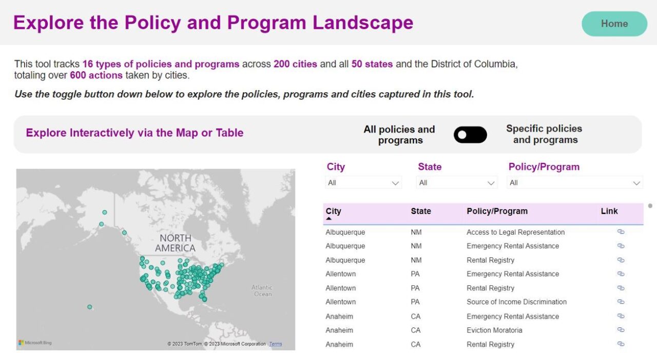
Data visualization is a growing field with a range of tools, including Power BI, Tableau, ArcGIS and others. There are also a wide variety of graph types including maps, bar charts, scatterplots and many more. There is no one-size-fits-all approach to effective visualization, but carefully considering the first two questions — why and who— will help guide local leaders in the process. To answer these questions, some great resources to reference include this Chart Guide from Storytelling with Data and a One Chart at a Time video series from PolicyViz, which include summaries of different charts and how they can be used effectively. NLC also employed data visualization in a brief to highlight how local leaders can leverage a variety of chart types in understanding the scope of evictions and the impact of emergency rental assistance programs.
Resources
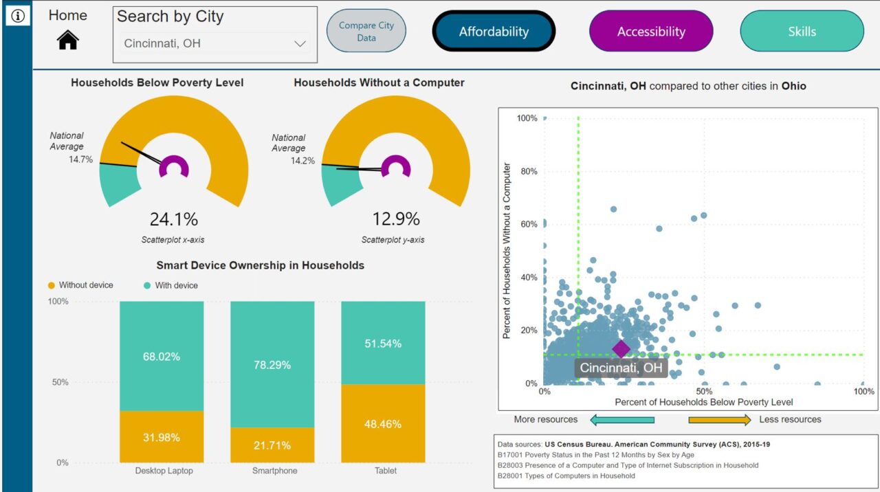
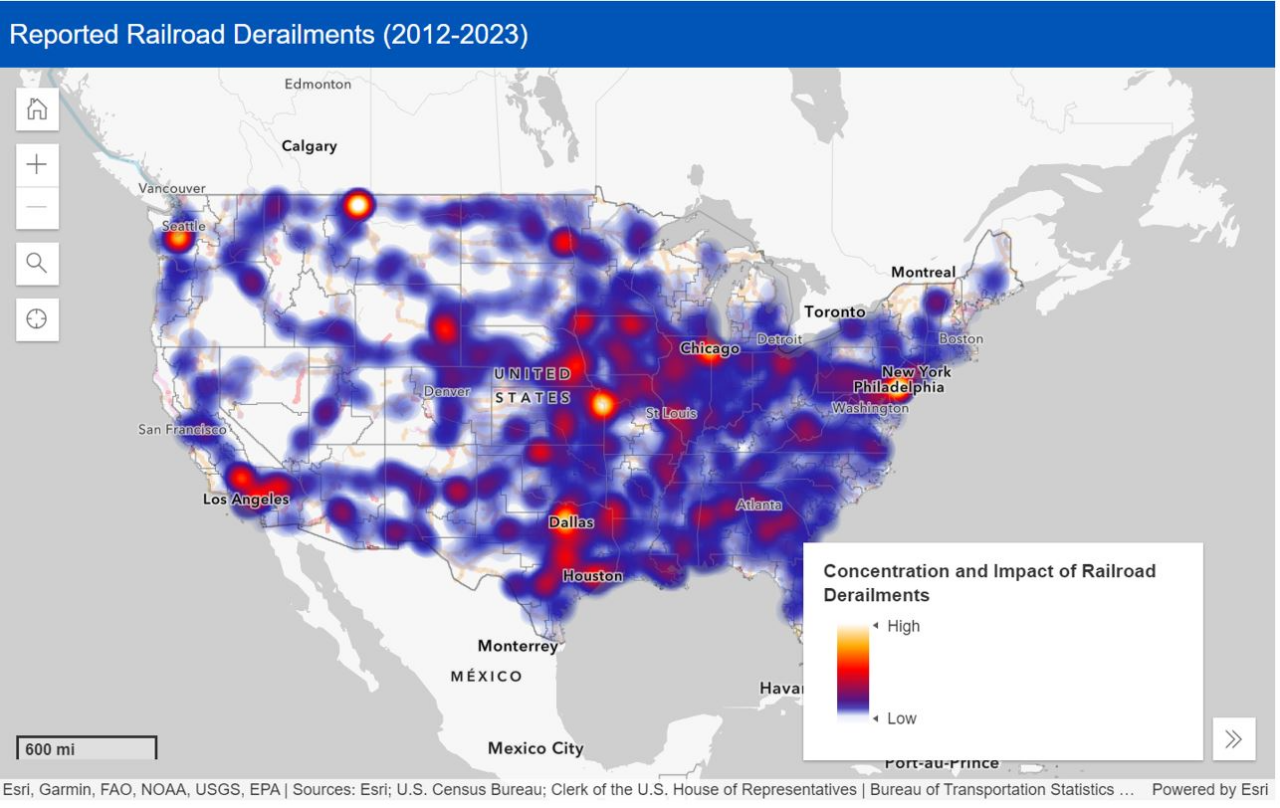
NLC has created a host of data visualizations and dashboards that provide valuable insights to inform and guide innovative local policymaking. These can provide inspiration into how to design data visualizations for your community.
Digital Equity Broadband Needs Assessment
Local Government ARPA Investment Tracker
Local Eviction Prevention Policy and Program Tool
Interactive Rail Safety Map: See Derailments in Communities Across the U.S.
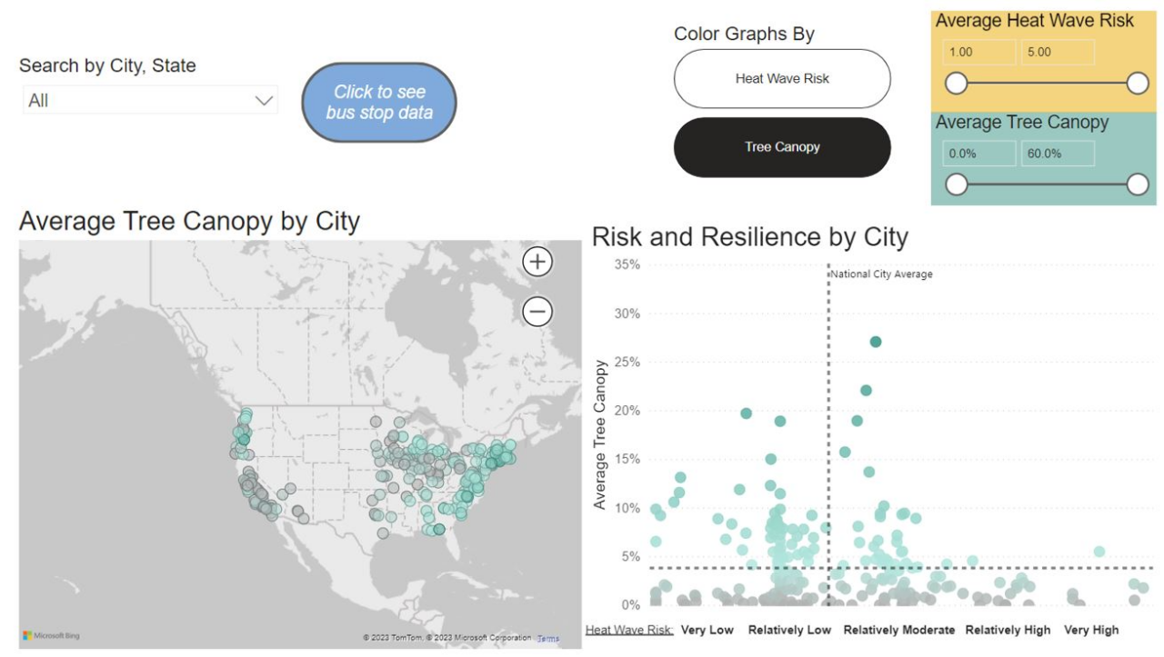
Urban Heat Island Effect Solutions and Funding
Learn More
If you are interested in learning more about this topic and sharing what your community is working on, NLC is launching a City Innovation Summer Learning Series at 2 p.m. Wednesday, June 28. The topic for the first session in the series is Leveraging Data Visualization to Promote Innovative Policymaking. Local leaders will share about work happening in their community, which will be followed by an interactive peer learning and Q&A discussion.


