Authored by City Health Dashboard
Across the United States, food insecurity remains a pressing public health challenge. In 2023, more than 18 million, or approximately one in seven, households were unable to reliably access affordable, healthy food. And the consequences extend beyond just hunger itself. Research links food insecurity to higher risks of depression, anxiety, diabetes, obesity and cardiovascular disease.
Food insecurity is shaped by individual, social and economic factors like income, employment, food prices and even access to transportation. Rising food costs, in particular, make it harder for individuals and families to both access and afford nutritious meals, further fueling food insecurity. Federal programs like the Supplemental Nutrition Assistance Program (SNAP), the Special Supplemental Nutrition Program for Women, Infants and Children (WIC), the National School Lunch Program (NSLP) and the School Breakfast Program have long contributed to reducing food insecurity. While there is ongoing debate about the future of these programs, they remain a critical safety net for millions.
A Closer Look at the City Health Dashboard and its Food Insecurity Metric
City leaders throughout the United States are searching for comprehensive solutions to food insecurity that meet their communities’ needs. The City Health Dashboard helps by providing the local data needed to guide evidence-based action. The Dashboard is a free, easy-to-use and interactive website that provides city and neighborhood-level data on over 45 metrics of health and its drivers, including diabetes, children in poverty, walkability and more. The Dashboard recently added a metric measuring Food Insecurity, which is the percentage of adults who report that, during the past year, they did not have enough food and did not have money to get more (PDF). On the Dashboard, this metric is available at the city and neighborhood (census tract) level, allowing users to see how food insecurity varies across neighborhoods within a city and helping to reveal disparities. These unique, local data can help shed light on food insecurity rates in your city.
Connecting Data to Community Solutions
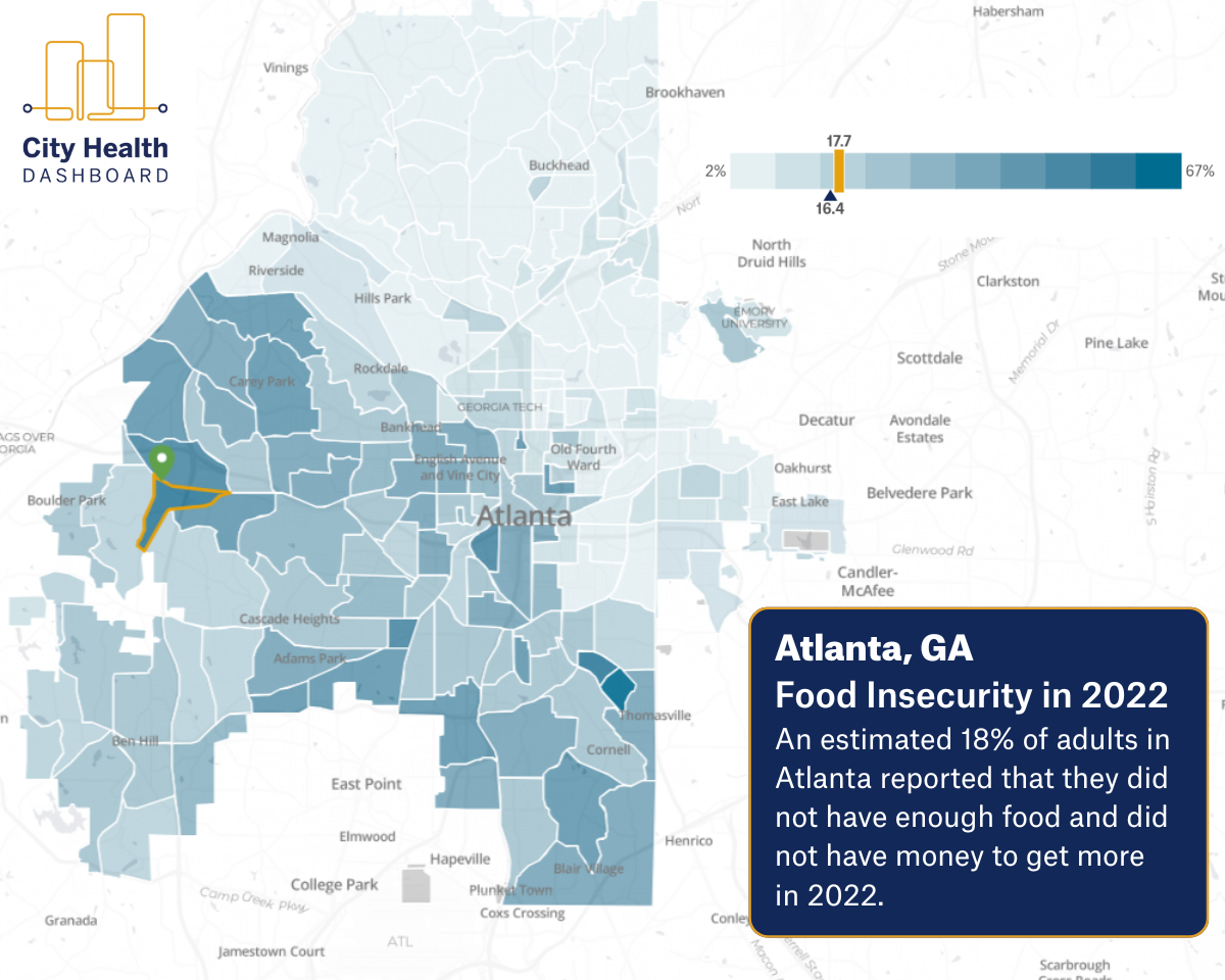
On the Dashboard’s maps, each neighborhood’s value is color-coded. Lighter blues indicate better outcomes, or lower food insecurity, and deeper blues indicate poorer outcomes, or greater food insecurity. This visual representation and color coding make it easier to identify patterns and dig deeper into potential contributing factors. For example, in Atlanta’s Adamsville neighborhood, the Atlanta Community Food Bank recently opened its newest Community Food Center. The center provides fresh produce and other non-perishable items, helping families facing food insecurity in the area. Using the City Health Dashboard, you can see that the food insecurity rates around the food bank, which is marked by the green pin, were relatively high in 2022. This indicated the need for additional local services, such as the Community Food Center that opened in August 2025, to support improved health outcomes.

National Patterns in Food Insecurity
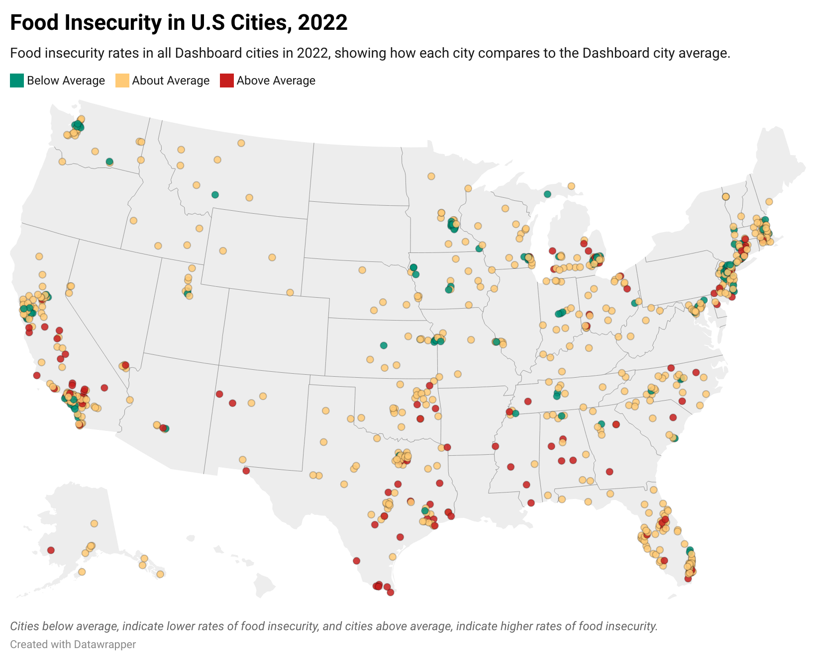
Not only does the Dashboard help to identify local patterns, it can also be used to understand national trends in food insecurity. The City Health Dashboard uses data calculated by the CDC’s PLACES project for its food insecurity metric, which is available for 39 states. The graphic below shows food insecurity rates in cities across the country and whether they are lower than, similar to or higher than the average rate across all Dashboard cities. Understanding these patterns is key. Cities in the South and in California often face higher food insecurity rates, underscoring the need for locally tailored solutions.
Explore the map below to see food insecurity across the U.S.

How City Leaders Can Use These Data
Mayors and other city leaders can use the Dashboard’s metrics, including Food Insecurity, in many ways, including:
- Visualizing geographic patterns. Mapping health-related metrics is a powerful first step in understanding systemic factors that contribute to differences in outcomes across neighborhoods. Identifying local trends within cities also helps highlight which solutions are working well, and where, so that success might be replicated elsewhere.
- Raising awareness. Sharing data with community members can spark conversations that help leaders learn more about how food insecurity affects residents’ daily lives.
- Building partnerships. Accessible data and visualizations create a shared language that can make collaboration and partnerships across public health agencies, educational systems and community organizations more effective and impactful.
- Supporting planning and funding. Dashboard data can inform program design and strengthen grant applications, helping leaders develop practical solutions that meet community needs.
Explore your city on the City Health Dashboard and find data specific to your community across 45+ metrics, including Food Insecurity, today.
Visit the NLC Strategic Partnerships page to learn more about the organizations like City Health Dashboard dedicated to making NLC the premier resource for local governments.
Connect With Us at City Summit
The City Health Dashboard relies on feedback from city leaders like you to ensure it continues to meet your data needs. We’re hosting a focus group at City Summit on Nov. 21 from 9:15 –10:15 AM to learn more about the work you do across jurisdictions and gather your feedback. By attending, you can help shape a tool that empowers policymakers with free and easily accessible health metrics. For more information and to RSVP to the focus group, send us an email. We look forward to seeing you there!


