While we go to the polls to cast our vote for a President that will set our national leadership for the next four years, the Census establishes a baseline for the apportionment of federal programs for the next decade. It has been two weeks since the end of in-person counting, Census’ Nonresponse Followup (NRFU), and we are just days away from Election Day. According to research by Professor Andrew Reamer of George Washington University, the Decennial Census guides the annual distribution of approximately $1.5 trillion in federal programs to states and localities. The final count is also used to apportion congressional and state legislative seats and districts and school districts.
NLC, in partnership with Esri, compared the 2010 to 2020 Census community self-response rates in the map below to get an early indication of where the risks around counts might arise. The self-response rate is defined as the proportion of households over the total number of housing units for a given geography (e.g., state, place, census tract) who responded to the census either online, by phone, or by mail. While the much smaller sample annual American Community Survey (ACS) has offered the online self-response option for several years, the 2020 Census is the first decennial census where all households had the option to respond online if they chose to do so.
In a recent paper by Census expert William O’Hare, he finds that lower response-rates are indicative of higher net undercounts and lower statistical accuracy of key socio-demographic groups (based on reviewing self-response rates from 1990, 2000, and 2010 censuses). An inaccurate count of either total population or of demographic subgroups such as young children and communities of color will be detrimental to national and local economic outlook and recovery from COVID over the next decade.
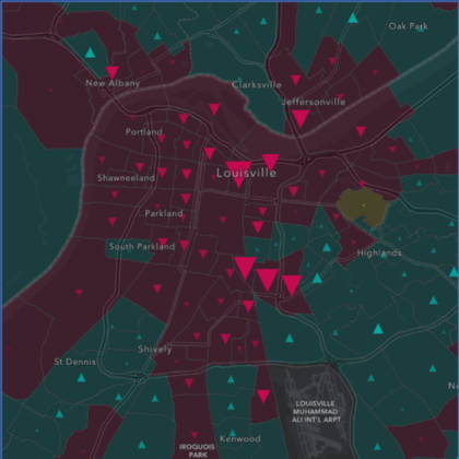
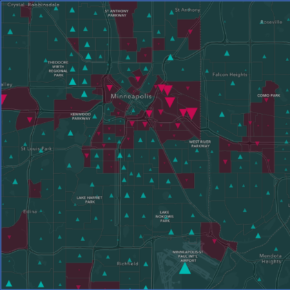
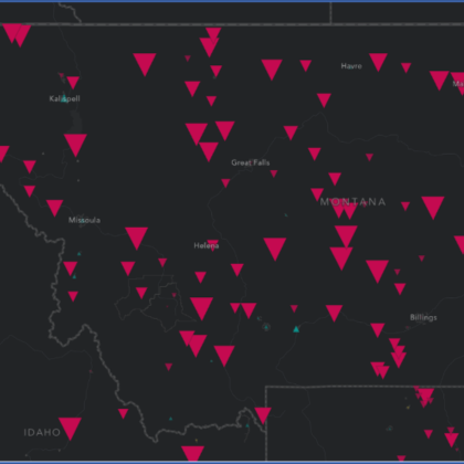
In the map below the maroon triangles reflect locales that had lower self-response rates in 2020 than in 2010. The turquoise triangles reflect locales that had higher self-response rates in 2020 than in 2010. The larger the triangle the larger the difference. If you zoom in, you can see this information down to the tract level.
Where do lower response rates appear in 2020?
A quick scan of the lower 48 states from west to east shows large decreases in 2020 response rates in Montana down through the central portions of South Dakota and Nebraska and western portions of Kansas, Oklahoma, and Texas. There are several other noticeable pockets across Southern Missouri, south of St. Louis; south and eastern Georgia; most of West Virginia; and upstate New York, north of Albany.
Response rate map of lower 48
Where do higher response rates appear in 2020?
In contrast a number of regions across the country saw higher response rates including:
- The Seattle and Portland regions in the Pacific Northwest;
- The Bay Area to Sacramento to Reno in California and Nevada;
- Around Salt Lake City in Utah;
- Southeastern South Dakota;
- The Twin Cities region in Minnesota;
- The New Orleans region in Louisiana;
- Southeastern Alabama;
- The Atlanta region in Georgia;
- The Louisville to Cincinnati corridor in Kentucky and Ohio;
- The Detroit area in Michigan; and
- The Virginia Beach to Richmond corridor to the Virginia suburbs of Washington, DC.
Zooming into Louisville and the Twin Cities shows a wide variation across regions in contrast to Montana, which shows mostly decreases in 2020 self-response rates.
In the coming weeks and months, we plan to incorporate additional layers to this map such as broadband penetration and socioeconomic characteristics from the most recent ACS, and how get-out-the-count initiatives may have impacted response rates. Looking to 2021 and beyond it will be imperative to achieve accurate counts as:
- Pharmaceutical companies and communities plan for how many COVID-19 vaccines and treatments, and associated supplies and equipment they might need;
- Existing and new businesses identify where they can provide services and/or set up shop as market conditions improve;
- Local leaders and advocates continue to support households that are under financial duress; and
- Communities learn and grapple with how and why socioeconomic inequalities persist and what systems and policies can be changed to start moving the needle.
Based on the current 2020 Census schedule the Census Bureau will deliver the apportionment counts to the President by December 31st and send redistricting counts to states to redraw legislative districts by April 1st, 2021. While in-person counting operations have ended there is still more work to be done to complete the 2020 Census.


